Tuesday 31 March 2015

Work Diary - Shoot 10

Evaluation

I found this shoot quite enjoyable and I think it turned out successfully. I went out at night to shoot because I knew the torch would contrast more significantly with the surroundings and therefore be more eye-catching. I turned the shutter speed down in order to create the long stroke of light. I tried to find a relatively empty area so that there were no distracting surroundings in the background. I remembered the photos I had seen of the same technique, and remembered how they used flash to clearly show the details and tones in the person, so that is what I did. After just taking images straight on from the front, I experimented with different angles. For one of these I held the camera slightly high up, creating a low angle shot of my model. I really liked the way this image had turned out so I continued to use this angle. On the other hand, another angle I had tried did not go so well. I stood on a small brick wall behind Rhiannon and tried to take a birds eye view shot looking directly above her. This didn't work well as the trail of light could not be seen well from this angle, and the models face was not visible. I found the shoot relatively easy and managed to create interesting and unique images.

One problem I had during this shoot was that most of the shapes I had asked Rhiannon to create didn't look recognisable as those shapes. I had asked her to make the shape of a star, a heart, and a box around her head but the outcome was not great. Despite this, the shapes that were created were interesting and abstract which I quite liked. Another problem I had encountered was that when looking at my contact sheets I noticed that the same white poll was clearly visible in the background of the photos. This distracted the eye away from the lights as it contrasted and stood out against the dark. To overcome this I managed to use the clone tool on photoshop to cover it.


Progression

Because I


Work Diary - Shoot 9

Evaluation


As I was shooting cars at night, I decided to shoot in London as I knew there would be a lot of cars on the road at night. This made the shoot easier for me as I did not have to sit around waiting for cars to pass. When I first started shooting for shoot 10, I found it quite difficult and my pictures were not turning out the way I had wanted them to. The lights from the cars were not elongated, but were just small blurred dots. Although this still looked like effectively out of focus, it was not the effect I had wanted to try out. I adjusted the settings on the camera and realised that I needed to lower the shutter speed. After I changed this to the lowest setting, the pictures started coming out a lot better and the effect I wanted to create was visible. After this moment I didn't find the shoot at all challenging. I decided to experiment with the flash, to see if the elongated lights would still be created, however I thought the images looked a lot better without it, as the vivid lights contrasted against the dark surroundings more significantly. I noticed that busses created a lot more elongated lights, and a more interesting image than cars, so I specifically looked out for these. It wasn't hard to spot them due to the location I was in. When It came to editing, I wanted to enhance the vivid lights and make them contrast even more against the very dark background. I noticed when editing the images that if I increased the exposure, buildings and other objects in the background that I did not spot in the darkness began to become visible. In some cases I found that this extra detail improved the image as it filled up empty space in the frame.

As well as having difficulty with camera settings, Most of the pictures did not turn out as good as I thought they would. After looking at some pictures online, I thought that the lines of light would be able to be seen a lot further into the distance, and one picture in particular gave me the idea that I might be able to capture the light travelling around bends.  None of my images ended up like this, but just as long solid lines. Although they did display movement, because they were so straight they might not be recognisable as cars. To overcome this I could have used an even lower shutter speed so that the lights could be seen far into the distance, however this was the lowest setting my camera would go. Effective images like the ones I had seen online would be more easily achieved using a camera with a larger variation of settings.


Progression

I want to continue photographing light into my next shoot. Because this shoot wasn't so successful, I want to try and shoot a different sort of light in order to get different and hopefully more successful results. Thinking back, one of the most successful shoots I have done was a portrait shoot, so I want to combine both light and portraits. One way I could do this is throughout light graffiti. Like this shoot, it involves a low shutter speed in order to show the clear path of light. As I would have someone else move the light around, I could show their face in a portrait style. Because I want to show the details of the person, I would have to use flash.

The picture below is an example of the sort of photos I would like to create. The path of the light is very clear, and contrasts significantly against the black background. It fills up the plain empty frame space and makes the image a lot more interesting. As well as the light, the mans face is clearly shown, and the tones in his skin are visible due to lighting.


I think that my next shoot will be enjoyable and I will end up with some interesting, unique and hopefully successful pictures.

Thursday 19 March 2015

Print Techniques

Black & White


Duotone


Selective Colour


Soft Focus


Repetition

 
Photojoiner


Work Diary - Shoot 8

Evaluation

I found this shoot very enjoyable as It was very different to shoots I had previously done. It was interesting and a new experience to shoot moving content as I had been used to shooting still objects. When I first started shooting, the location I had chosen was not very appropriate for the shoot. There was a lot going on in the background which made the smoke harder to see as it got lost in the background. None of the images were turing out the way I had wanted them to at the start of the shoot but It took me a while to realise it was the background that was the problem. I thought about the different smoke photography I had seen online, and how the backgrounds used were very plain in order to make the smoke stand out. I moved around a lot in order to find an appropriate location, and eventually I found a quiet, empty pathway which worked as a good backdrop and at the same time showed depth. This was were most of my successful images were taken.  At first I only took one or two pictures for each time the smoke was breathed out. this is because I was focussing on when the smoke looked best and took pictures at these times. I had then decided shortly after to take as many pictures as I could for each time the smoke was breathed out, and this meant that I produced a lot more images and a lot more variation to choose from. When it came to editing I thought about the images I had seen online, and how the majority of them were edited black and white and how effective this was. Because of this I ended up editing my images in this way which allowed the tones and the form in the smoke to be seen, and it also made it contrast more against the background which made it stand out more. Despite this, I wanted to leave one of the images in colour just to produce more varied straight images and also experiment with showing tone in coloured images. Overall I am very happy with the outcome of this shoot and produced some good edits, including a multiple image showing the process of this exhalation of smoke, which is one of my favourite edits I have created.

Problems I've experienced during this shoot include finding a suitable background. I wasted a lot of time taking pictures in front of inappropriate backgrounds which reduced the quality of my images. One of these backgrounds was a stair rail. Because it was very bold, it distracted the eye away from the content in the foreground, but the smoke also became lost in this background detail. One other problem was the wind. Because I went out to shoot on a windy day, the smoke sometimes blew backwards which didn't create very good images. To overcome this I made my model turn to face different ways until I found a position that allowed the smoke to travel forward without interference from the wind.


The image above is one from the shoot which I am quite happy with. I took this picture towards the end of the shoot when I had found a suitable background. Because the pathway is empty there is nothing to distract the eye away from the smoke. Because there is no one in the area, a sense of loneliness is created which is what I wanted to do. The depth shown by the path getting thinner and blurring also does this. The white smoke contrasts well against the dull plain background so the different shapes in it are clear. I also like the way it travels upwards as this shows movement. Looking at other aspects of the image, different tones are clearly shown in the leather jacket which brings out texture, which is something I like about the image. Texture is also apparent in the hair of the model. 


This image on the other hand, is one of my least favourite from the shoot. This was one that I had taken at the beginning of the shoot, when I was having trouble with backgrounds. It is easy to see that the bold stair railings draw in the eye and distract focus away from the smoke. I was not able to edit it out like I have been able to do in other situations similar to this because of the size. Another problem with this image is that the smoke is not very clear and is quite spread out rather than thick and bold like in other images. The quality of the image is not very good as the face is slightly blurry. Despite these points, I quite like the composition of the image and the way lines are clearly shown in the background. I also like the texture of the hair.


Progression

After doing this shoot I realised that I need to think a lot about backgrounds, as they can easily change the effectiveness of the image. As well as seeing how plain backgrounds can bring out the foreground, while busy backgrounds can distract attention away from the foreground, I also realised that the background helps to create a certain feel. For example, In some of my images from this shoot I shot in front of a long, empty path. I realised that this worked well to create a sense of loneliness in the picture. This is something I will think about in future shoots in order to create good images which tell a story. Although I did really enjoy this shoot, after looking at some photography online I want to experiment with long exposure as I find it is a very interesting and creative approach to showing movement. Also I have not done any movement photography yet in this movement and would like to have a go. I think that this effect could be easily achievable by adjusting the shutter speed on my camera.


These images are examples of the kind of photos I would like to create in my next shoot. Ones which involve shooting moving cars on the road. After looking at images like I noticed they are all done in the  dark in order for the vivd lights to contrast well against the sky and stand out. Also, they are mostly taken on busy roads in order to create ongoing trails of light. I will take this into account when I shoot. 

Wednesday 18 March 2015

Work Diary - Shoot 7

Evaluation

shoot 8 was by far my favourite shoot so far. This was the first time I had shot location portraits and full body shots and I found it really enjoyable and liked the fact I could get quite creative with it. Something I wanted to convey through these images was individuality, so I chose my model because I knew she had a unique and urban look. To emphasise this I asked her to wear ripped jeans and a leather jacket as well as a heavy band shirt to add to the rock look she had. When It came to her face, I added extra eyeliner, black lipstick and also chose for her to wear a fake piercing. I was very happy with my models overall look. I decided to shoot these images on location as I think the surroundings sometimes tell us more about a person in a photograph. I wanted to shoot in urban locations so that they related to the style of the model. I shot in front of brick walls, graffiti, on bridges and on stone steps. When it came to actions and poses, I wanted my model to clearly show attitude to match her style. In most cases I had asked her to show a serious expression and look directly towards the camera to seem confident and intimidating. I also asked her to stand up straight and hold onto her jacket or play with her hair also to show confidence. In some of the images I delibirately positioned the camera low down so that it was angled upwards, in order to make the model seem high up to show power, which worked together with the serious expression and overall looked quite effective. I decided to shoot some of the images from the back so that my models face could not be seen. I liked this idea as it created a sense of mystery but also allows us to see the models unique shaved patch of hair which emphasises individuality. Throughout the shoot I constantly thought about composition, and filling the frame well, as I have learnt from previous shoots, so in most of my images my model fills up a lot of the frame and there is not a lot of empty space. When it came to editing I wanted to continue the urban theme and emphasise the rock style of the model. I immediately thought the make the pictures look darker and dull. To do this I turned down the exposure and the saturation so that the colours were not very bright, which related to the lack of colour in the models clothing. In some cases I included a bit of offset which really worked quite effectively. I am very happy with the overall look of the images and the way the editing relates to the context of the pictures.

One negative aspect of the shoot was because I had shot on a dull day, from some angles the lighting was very bad and the models facial features could not be seen clearly. To overcome this at the time I just moved my model into a different location or shot from a different angle, but looking back now, I could have used the flash on my camera to brighten the image and allow the facial features to be shown. This is a technique I can experiment with in future shoots if the same problems occur.


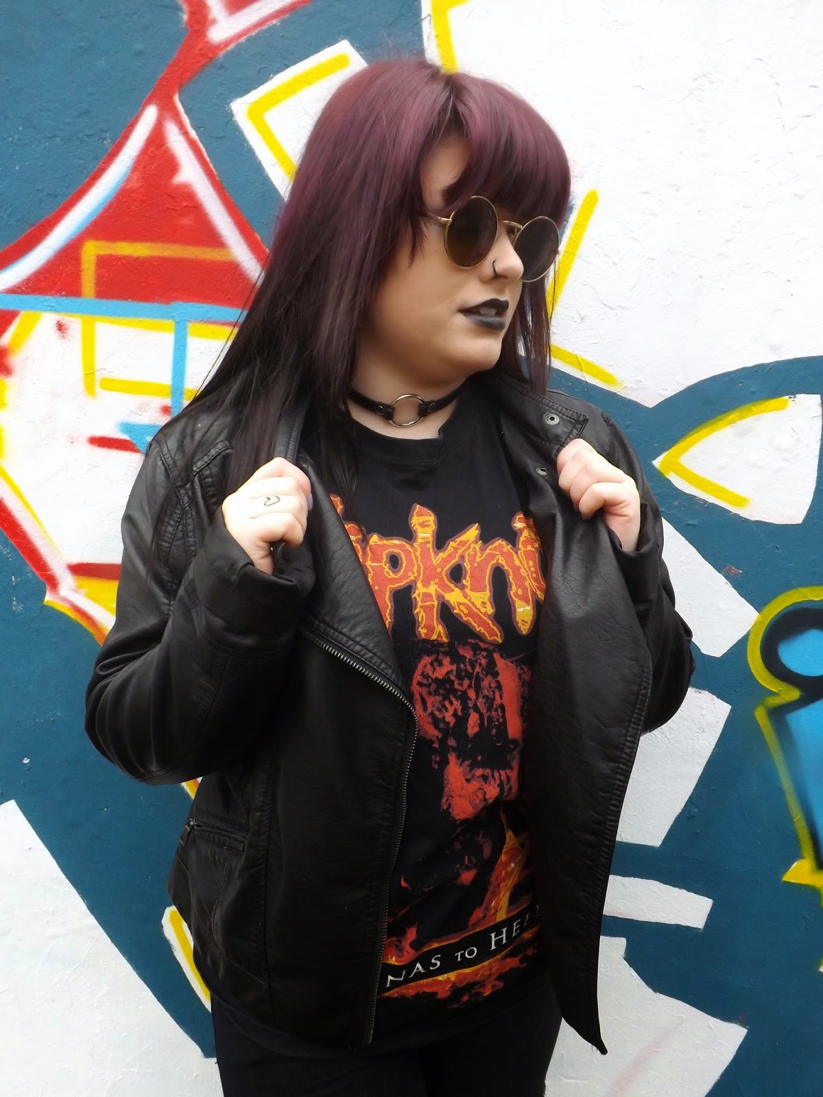
This image above is one of my favourites from the shoot, that I went on to edit and post on my blog as a straight image. Firstly, I really like the backdrop of this photo, and how it emphasises the overall urban look. The vivid colours contrast against the dull colours of the models clothing which helps her to stand out. I think that it is quite effective that we cannot see what the background actually is, and the fact it fills the whole frame. The position of the model shows attitude and confidence which is the type of personality I wanted to convey. The use of glasses adds to the rock look and also creates a sense of mystery as the eyes are usually focussed on in portraits but here they are hidden. I like the way she is looking away from the camera as it implies this could be an action shot. The leather jacket is a good touch as both tone and texture are clearly shown here. I am happy with the way the background of the image relates to the context. 


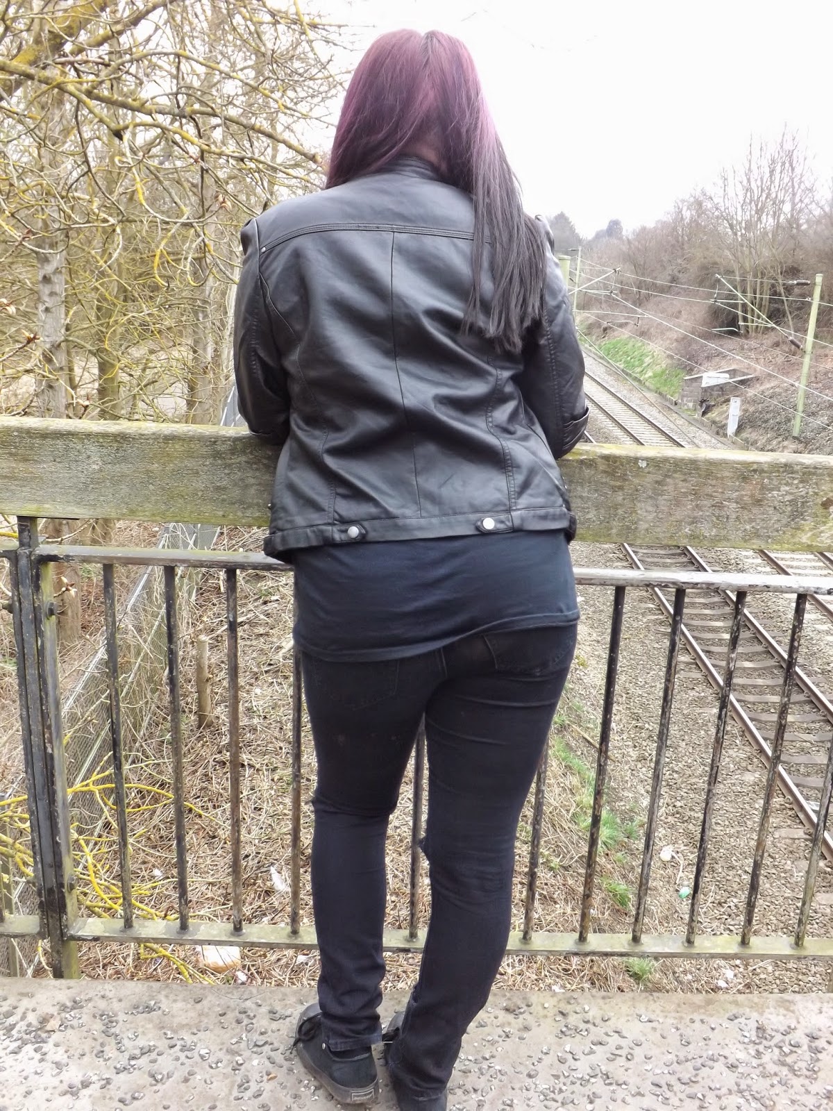
This image on the other hand, is my least favourite from shoot 8. Firstly, I am not too keen on the background of the photo. Half of the background is full of trees while in the other half we can see a railway track. Because there is a lot of content in the background, focus is taken off of the person in the foreground, which is supposed to be the main focus of the image. If I had moved the model a bit to the right so that she was standing directly above the railway, I think the image would have been more effective as it would show clear lines and depth and the background would not be overcomplicated. Secondly, I think this image would have been better if it had been taken from just the waist up. This would allow more detail of the hair and jacket to be shown, and would allow get rid of a lot of the space in the frame. On the other hand, I really like the tones that are shown in the jacket, and how they create clear texture. 


Progression

From this shoot I have learnt about lighting. I know now that I can use the camera flash in daylight just to make certain features of the image clearer and brighter. Although I have improved with my composition, this is something I would still like to get even better at, as I found that in a few cases like the image above, the foreground was not focused on as much due to the amount of content we can see in the background. This is something i will think about in my next shoot. As I really enjoyed shooting these location portraits, this is something I am going to continue into my next shoot, but rather than shooting full body pictures I want to focus more on the face. Because I really liked how these images turned out and how I managed to create a clear urban look, I also want to create this same feel in shoot 9. To do this I could use smoke, which will also help me fill the frame well. I have seen a lot of smoke photography online which I have really liked, as a range of different tones are shown as well as unusual and interesting shapes within the smoke which could makes the images appealing for the eye. Also, I want to create more photomontage images as previous ones such as my graffiti one from shoot 4 worked so well. 


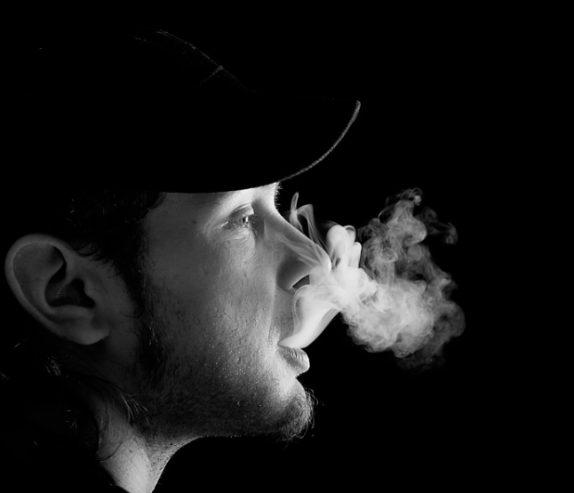
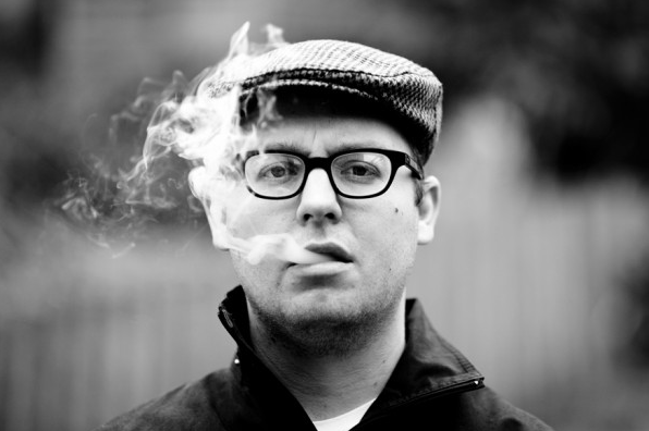
The images above are examples of the kind of images I would like to create in my next shoot. When looking at smoke photography I realised that the majority of it is black and white, in order to make the contrast and tones in the smoke clearer. This is something I will think about when editing my pictures. Also in most cases there is not a lot going on in the backgrounds, so that the smoke can be seen clearly and does not get lost in the detail of the background. This is also something I will need to take into account.