Showing posts with label Work Diary. Show all posts

Tuesday, 31 March 2015

Work Diary - Shoot 10

Evaluation

I found this shoot quite enjoyable and I think it turned out successfully. I went out at night to shoot because I knew the torch would contrast more significantly with the surroundings and therefore be more eye-catching. I turned the shutter speed down in order to create the long stroke of light. I tried to find a relatively empty area so that there were no distracting surroundings in the background. I remembered the photos I had seen of the same technique, and remembered how they used flash to clearly show the details and tones in the person, so that is what I did. After just taking images straight on from the front, I experimented with different angles. For one of these I held the camera slightly high up, creating a low angle shot of my model. I really liked the way this image had turned out so I continued to use this angle. On the other hand, another angle I had tried did not go so well. I stood on a small brick wall behind Rhiannon and tried to take a birds eye view shot looking directly above her. This didn't work well as the trail of light could not be seen well from this angle, and the models face was not visible. I found the shoot relatively easy and managed to create interesting and unique images.

One problem I had during this shoot was that most of the shapes I had asked Rhiannon to create didn't look recognisable as those shapes. I had asked her to make the shape of a star, a heart, and a box around her head but the outcome was not great. Despite this, the shapes that were created were interesting and abstract which I quite liked. Another problem I had encountered was that when looking at my contact sheets I noticed that the same white poll was clearly visible in the background of the photos. This distracted the eye away from the lights as it contrasted and stood out against the dark. To overcome this I managed to use the clone tool on photoshop to cover it.


Progression

Because I


Work Diary - Shoot 9

Evaluation


As I was shooting cars at night, I decided to shoot in London as I knew there would be a lot of cars on the road at night. This made the shoot easier for me as I did not have to sit around waiting for cars to pass. When I first started shooting for shoot 10, I found it quite difficult and my pictures were not turning out the way I had wanted them to. The lights from the cars were not elongated, but were just small blurred dots. Although this still looked like effectively out of focus, it was not the effect I had wanted to try out. I adjusted the settings on the camera and realised that I needed to lower the shutter speed. After I changed this to the lowest setting, the pictures started coming out a lot better and the effect I wanted to create was visible. After this moment I didn't find the shoot at all challenging. I decided to experiment with the flash, to see if the elongated lights would still be created, however I thought the images looked a lot better without it, as the vivid lights contrasted against the dark surroundings more significantly. I noticed that busses created a lot more elongated lights, and a more interesting image than cars, so I specifically looked out for these. It wasn't hard to spot them due to the location I was in. When It came to editing, I wanted to enhance the vivid lights and make them contrast even more against the very dark background. I noticed when editing the images that if I increased the exposure, buildings and other objects in the background that I did not spot in the darkness began to become visible. In some cases I found that this extra detail improved the image as it filled up empty space in the frame.

As well as having difficulty with camera settings, Most of the pictures did not turn out as good as I thought they would. After looking at some pictures online, I thought that the lines of light would be able to be seen a lot further into the distance, and one picture in particular gave me the idea that I might be able to capture the light travelling around bends.  None of my images ended up like this, but just as long solid lines. Although they did display movement, because they were so straight they might not be recognisable as cars. To overcome this I could have used an even lower shutter speed so that the lights could be seen far into the distance, however this was the lowest setting my camera would go. Effective images like the ones I had seen online would be more easily achieved using a camera with a larger variation of settings.


Progression

I want to continue photographing light into my next shoot. Because this shoot wasn't so successful, I want to try and shoot a different sort of light in order to get different and hopefully more successful results. Thinking back, one of the most successful shoots I have done was a portrait shoot, so I want to combine both light and portraits. One way I could do this is throughout light graffiti. Like this shoot, it involves a low shutter speed in order to show the clear path of light. As I would have someone else move the light around, I could show their face in a portrait style. Because I want to show the details of the person, I would have to use flash.

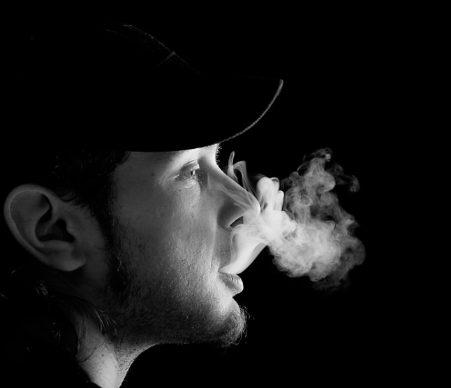
The picture below is an example of the sort of photos I would like to create. The path of the light is very clear, and contrasts significantly against the black background. It fills up the plain empty frame space and makes the image a lot more interesting. As well as the light, the mans face is clearly shown, and the tones in his skin are visible due to lighting.


I think that my next shoot will be enjoyable and I will end up with some interesting, unique and hopefully successful pictures.

Thursday, 19 March 2015

Work Diary - Shoot 8

Evaluation

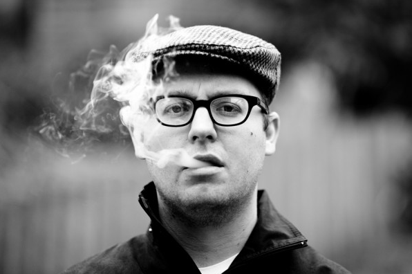
I found this shoot very enjoyable as It was very different to shoots I had previously done. It was interesting and a new experience to shoot moving content as I had been used to shooting still objects. When I first started shooting, the location I had chosen was not very appropriate for the shoot. There was a lot going on in the background which made the smoke harder to see as it got lost in the background. None of the images were turing out the way I had wanted them to at the start of the shoot but It took me a while to realise it was the background that was the problem. I thought about the different smoke photography I had seen online, and how the backgrounds used were very plain in order to make the smoke stand out. I moved around a lot in order to find an appropriate location, and eventually I found a quiet, empty pathway which worked as a good backdrop and at the same time showed depth. This was were most of my successful images were taken.  At first I only took one or two pictures for each time the smoke was breathed out. this is because I was focussing on when the smoke looked best and took pictures at these times. I had then decided shortly after to take as many pictures as I could for each time the smoke was breathed out, and this meant that I produced a lot more images and a lot more variation to choose from. When it came to editing I thought about the images I had seen online, and how the majority of them were edited black and white and how effective this was. Because of this I ended up editing my images in this way which allowed the tones and the form in the smoke to be seen, and it also made it contrast more against the background which made it stand out more. Despite this, I wanted to leave one of the images in colour just to produce more varied straight images and also experiment with showing tone in coloured images. Overall I am very happy with the outcome of this shoot and produced some good edits, including a multiple image showing the process of this exhalation of smoke, which is one of my favourite edits I have created.

Problems I've experienced during this shoot include finding a suitable background. I wasted a lot of time taking pictures in front of inappropriate backgrounds which reduced the quality of my images. One of these backgrounds was a stair rail. Because it was very bold, it distracted the eye away from the content in the foreground, but the smoke also became lost in this background detail. One other problem was the wind. Because I went out to shoot on a windy day, the smoke sometimes blew backwards which didn't create very good images. To overcome this I made my model turn to face different ways until I found a position that allowed the smoke to travel forward without interference from the wind.


The image above is one from the shoot which I am quite happy with. I took this picture towards the end of the shoot when I had found a suitable background. Because the pathway is empty there is nothing to distract the eye away from the smoke. Because there is no one in the area, a sense of loneliness is created which is what I wanted to do. The depth shown by the path getting thinner and blurring also does this. The white smoke contrasts well against the dull plain background so the different shapes in it are clear. I also like the way it travels upwards as this shows movement. Looking at other aspects of the image, different tones are clearly shown in the leather jacket which brings out texture, which is something I like about the image. Texture is also apparent in the hair of the model. 


This image on the other hand, is one of my least favourite from the shoot. This was one that I had taken at the beginning of the shoot, when I was having trouble with backgrounds. It is easy to see that the bold stair railings draw in the eye and distract focus away from the smoke. I was not able to edit it out like I have been able to do in other situations similar to this because of the size. Another problem with this image is that the smoke is not very clear and is quite spread out rather than thick and bold like in other images. The quality of the image is not very good as the face is slightly blurry. Despite these points, I quite like the composition of the image and the way lines are clearly shown in the background. I also like the texture of the hair.


Progression

After doing this shoot I realised that I need to think a lot about backgrounds, as they can easily change the effectiveness of the image. As well as seeing how plain backgrounds can bring out the foreground, while busy backgrounds can distract attention away from the foreground, I also realised that the background helps to create a certain feel. For example, In some of my images from this shoot I shot in front of a long, empty path. I realised that this worked well to create a sense of loneliness in the picture. This is something I will think about in future shoots in order to create good images which tell a story. Although I did really enjoy this shoot, after looking at some photography online I want to experiment with long exposure as I find it is a very interesting and creative approach to showing movement. Also I have not done any movement photography yet in this movement and would like to have a go. I think that this effect could be easily achievable by adjusting the shutter speed on my camera.


These images are examples of the kind of photos I would like to create in my next shoot. Ones which involve shooting moving cars on the road. After looking at images like I noticed they are all done in the  dark in order for the vivd lights to contrast well against the sky and stand out. Also, they are mostly taken on busy roads in order to create ongoing trails of light. I will take this into account when I shoot. 

Wednesday, 18 March 2015

Work Diary - Shoot 7

Evaluation

shoot 8 was by far my favourite shoot so far. This was the first time I had shot location portraits and full body shots and I found it really enjoyable and liked the fact I could get quite creative with it. Something I wanted to convey through these images was individuality, so I chose my model because I knew she had a unique and urban look. To emphasise this I asked her to wear ripped jeans and a leather jacket as well as a heavy band shirt to add to the rock look she had. When It came to her face, I added extra eyeliner, black lipstick and also chose for her to wear a fake piercing. I was very happy with my models overall look. I decided to shoot these images on location as I think the surroundings sometimes tell us more about a person in a photograph. I wanted to shoot in urban locations so that they related to the style of the model. I shot in front of brick walls, graffiti, on bridges and on stone steps. When it came to actions and poses, I wanted my model to clearly show attitude to match her style. In most cases I had asked her to show a serious expression and look directly towards the camera to seem confident and intimidating. I also asked her to stand up straight and hold onto her jacket or play with her hair also to show confidence. In some of the images I delibirately positioned the camera low down so that it was angled upwards, in order to make the model seem high up to show power, which worked together with the serious expression and overall looked quite effective. I decided to shoot some of the images from the back so that my models face could not be seen. I liked this idea as it created a sense of mystery but also allows us to see the models unique shaved patch of hair which emphasises individuality. Throughout the shoot I constantly thought about composition, and filling the frame well, as I have learnt from previous shoots, so in most of my images my model fills up a lot of the frame and there is not a lot of empty space. When it came to editing I wanted to continue the urban theme and emphasise the rock style of the model. I immediately thought the make the pictures look darker and dull. To do this I turned down the exposure and the saturation so that the colours were not very bright, which related to the lack of colour in the models clothing. In some cases I included a bit of offset which really worked quite effectively. I am very happy with the overall look of the images and the way the editing relates to the context of the pictures.

One negative aspect of the shoot was because I had shot on a dull day, from some angles the lighting was very bad and the models facial features could not be seen clearly. To overcome this at the time I just moved my model into a different location or shot from a different angle, but looking back now, I could have used the flash on my camera to brighten the image and allow the facial features to be shown. This is a technique I can experiment with in future shoots if the same problems occur.
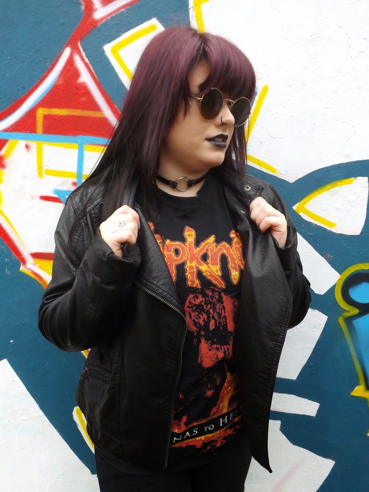

This image above is one of my favourites from the shoot, that I went on to edit and post on my blog as a straight image. Firstly, I really like the backdrop of this photo, and how it emphasises the overall urban look. The vivid colours contrast against the dull colours of the models clothing which helps her to stand out. I think that it is quite effective that we cannot see what the background actually is, and the fact it fills the whole frame. The position of the model shows attitude and confidence which is the type of personality I wanted to convey. The use of glasses adds to the rock look and also creates a sense of mystery as the eyes are usually focussed on in portraits but here they are hidden. I like the way she is looking away from the camera as it implies this could be an action shot. The leather jacket is a good touch as both tone and texture are clearly shown here. I am happy with the way the background of the image relates to the context. 
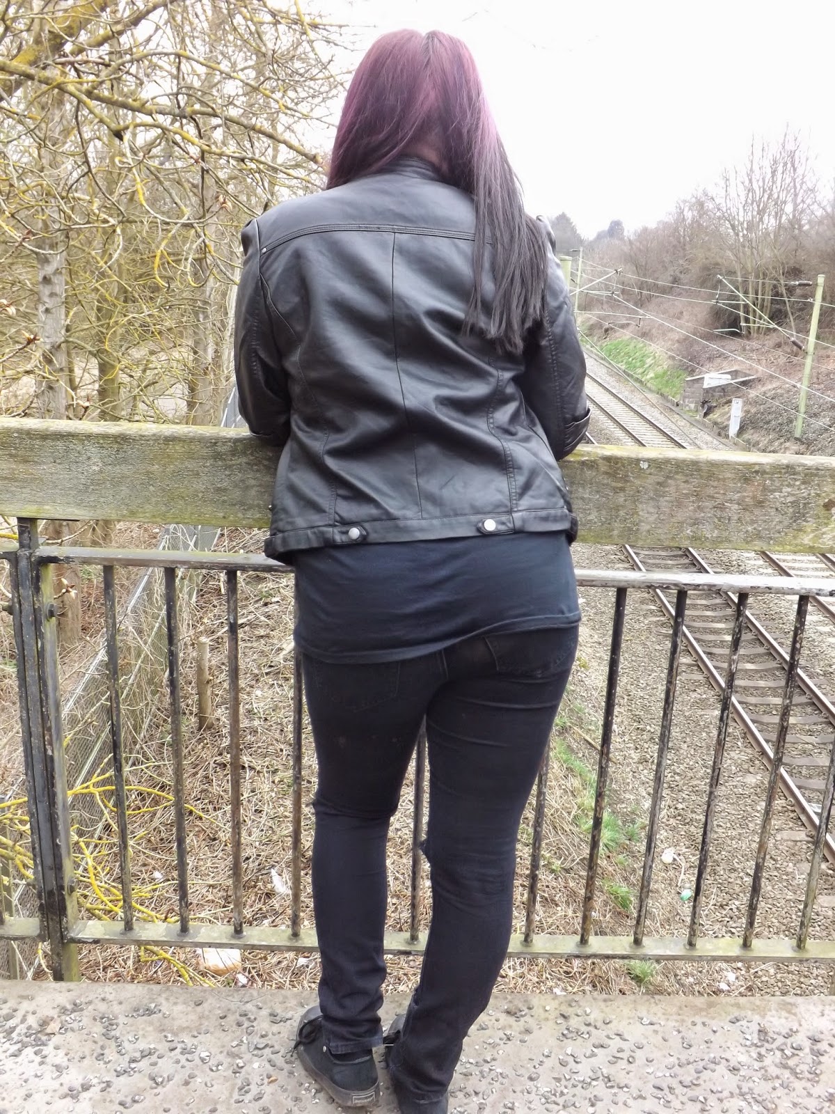


This image on the other hand, is my least favourite from shoot 8. Firstly, I am not too keen on the background of the photo. Half of the background is full of trees while in the other half we can see a railway track. Because there is a lot of content in the background, focus is taken off of the person in the foreground, which is supposed to be the main focus of the image. If I had moved the model a bit to the right so that she was standing directly above the railway, I think the image would have been more effective as it would show clear lines and depth and the background would not be overcomplicated. Secondly, I think this image would have been better if it had been taken from just the waist up. This would allow more detail of the hair and jacket to be shown, and would allow get rid of a lot of the space in the frame. On the other hand, I really like the tones that are shown in the jacket, and how they create clear texture. 


Progression

From this shoot I have learnt about lighting. I know now that I can use the camera flash in daylight just to make certain features of the image clearer and brighter. Although I have improved with my composition, this is something I would still like to get even better at, as I found that in a few cases like the image above, the foreground was not focused on as much due to the amount of content we can see in the background. This is something i will think about in my next shoot. As I really enjoyed shooting these location portraits, this is something I am going to continue into my next shoot, but rather than shooting full body pictures I want to focus more on the face. Because I really liked how these images turned out and how I managed to create a clear urban look, I also want to create this same feel in shoot 9. To do this I could use smoke, which will also help me fill the frame well. I have seen a lot of smoke photography online which I have really liked, as a range of different tones are shown as well as unusual and interesting shapes within the smoke which could makes the images appealing for the eye. Also, I want to create more photomontage images as previous ones such as my graffiti one from shoot 4 worked so well. 


The images above are examples of the kind of images I would like to create in my next shoot. When looking at smoke photography I realised that the majority of it is black and white, in order to make the contrast and tones in the smoke clearer. This is something I will think about when editing my pictures. Also in most cases there is not a lot going on in the backgrounds, so that the smoke can be seen clearly and does not get lost in the detail of the background. This is also something I will need to take into account.

Thursday, 12 March 2015

Shoot 6 - Work Diary

Evaluation

I found this shoot quite difficult. As it had not been raining I decided to go out when It was just cloudy. This allowed me to take good pictures of the sky, however there was a limit to how many close ups I could take, as there is no physical evidence which isn't the sky, for example snow on a leaf or rain on a window.  Because of this I tried to vary my sky images, for example taking pictures of objects against it, taking them from different angles and including buildings. Despite these different approaches, a lot of my images still ended up looking very similar. i tried to think harder about different close ups I could take which imply cloudy weather, and I noticed that because it was windy the leaves were blowing around the floor a lot. I really wanted to capture this movement, but when I took the photos the leaves looked very still and there was no blurring to suggest any movement. Thinking back to this, I could have overcome this problem by decreasing the shutter speed so that there would be a slight blur as the leaves moved. This would have worked very effectively and captured movement well to show windy weather.

Despite this, after the shoot I took 4 of the images and put them together in a multiple image. The outcome of this was not bad and allowed me to show different aspects of cloudy weather. Also, while editing I turned the exposure down while increasing the contrast in order to show the form of the dark cloud a but clearer, which emphasised the type of weather. Changing the contrast also allowed the objects in the images for example a lampost or building to have a clearer outline.


This image is one of the pictures from shoot 6 that I included in my multiple image. I quite like this photo because as well as showing weather is also clearly shows depth and shape. I took the photo from a very low angle and pointed it upwards, and this made the lampost look smaller at the top and bigger at the bottom clearly showing depth and length. The lampost creates a dark silhouette which significantly contrasts against the dull sky, showing a clear shape and outline. 


This image on the other hand, did not go as well as I had wanted. This was taken towards the end of the shoot, when i had taken a lot of similar images and wanted to try something more unique. I attempted to show the cloudy sky through reflection, however as you can see the reflection is very faint and really does not clearly show weather. Firstly, you can see a lot of the content inside the room, which distracts attention away from the reflection. This also makes the image quite confusing for the eye as two different scenes are overlapped. Secondly, the reflection does show the sky, however the clouds are really unclear so that the weather is not clearly established. Also, the reflection also consists of buildings which takes up frame space. If I was to shoot this image again I would make sure the reflection only consisted of the sky, so that other factors did not distract attention away from the weather. To slightly improve this image I could increase the contrast in order to bring out the form of the clouds. 


Progression

If I was to do another weather shoot I would go out in more extreme weather such as a storm or snow so that the weather is the clearest aspect of the images. I could also use props and place them in different locations and different weathers, for example when it is sunny I could take close ups of sunglasses in a sunny spot, or place some wellies in a puddle and take pictures of this. Despite these ideas, the last two shoot have not really gone to plan and I do not want to continue shooting weather. I did quite like the multiple image aspect of this shoot however, and I would like to try some other kinds of photomontage as I have not done a lot of this in my photography so far. I have decided that I would like to experiment with portrait photography in my next shoot as this is something I really enjoy and something I have not done a lot of so far in this unit. 


These images are an example of the kind of portraits I would like to take in my next shoot. I want to take my pictures in quite urban areas like in front of graffiti, on bridges, or on stairs. My model to have a grunge style which will relate to the reinforce the urban feel of the images. I have noticed that a lot of portraits are edited black and white, so that the different tones in the face are clearer and show form. This is something I will think about when it comes to editing my images. I would also like to explore with photo montage in Photoshop, so I may think about producing a multiple image from these portraits.  

Tuesday, 10 March 2015

Shoot 5 - Work Diary

Evaluation

I found the evidence of weather shoot quite difficult, as it was difficult to express and emphasise certain types of weather. I went outside when it was relatively sunny, however the weather was not extreme enough to clearly show evidence of weather. For example, If I went out in a massive storm or in the snow the weather in these images would be more focused on. On occasions the sun went in so that no specific type of weather was apparent, and made some of my images irrelevant to the theme. I also found that I had quickly run out of ideas for what to shoot. After I had shot pictures of the sky and of some shadows I found it difficult to think of other things on location that I could shoot to establish weather, so I did not end up with a lot of photos and the ones I did take did not have much variation. Most of my images were of landscapes rather than close ups of certain features, as I did not know what specific objects could relate to or indicate the weather.

Despite these negative points, I did produce some interesting and well composed images of shadows which implies the weather is sunny. Also, I was able to enhance the brightness of the images so that they showed sunny weather more obviously.


In this photo I attempted to show shadow in order to imply sunny weather but it did not really turn out the way I wanted. The shadow only takes up a very small amount of the frame so that it is not very focussed on, and the colourful background catches the eye more than the shadow. To overcome this I could edit the image black and white so the the colourful surrounding are not distracting, however there would still be a problem with composition. I found it difficult to find a good angle to shoot this image, as I wanted to show both the shadow and its source. if i was to shoot this image again I might think about taking the image a bit closer up, so that the lamppost can still be seen but the shadow is bigger and clearer. Despite this, a clear shadow is created as it contrasts against the textured wall in order to show a clear outline. I also like the way the shadow bends as it travels up the wall. 


This is another image I had taken during shoot 5, which i quite like. It shows how the sun can create distorted shadows depending on angle. I like the way there is a clear shadow from the stairs, but also from me. The legs are very elongated which shows depth and also lines. Other types of lines are also apparent in this image  for example in the stairs, the rails, and the textured brick wall. One other thing I like about this image is that almost all of the frame is filled, so that the eye immediately focusses on the shadows rather than the surroundings. I went on to edit this image black and white so that the contrast between the stairs and floor, and the dark shadows is even clearer.


Progression

If I decide to shoot weather again I will make sure the weather is easily recognised for example a storm or snow, rather than discreet, average weather. This would have produced some nice close ups for example a snow covered leaf or rain falling down a window. I want to continue with this topic into my next shoot, however I want to shoot a different type of weather so I can contrast it against todays shoot. I think that I might go out on a rainy day to shoot, as snow is very unlikely and rain will contrast well against sun. I want to try out some type of photomontage as this worked so well with my graffiti shoot. This way I can show different aspects of weather all in one photo.


These two images are examples of the kind of images I hope to take in my next shoot. I want to take pictures of a large landscape including the sky so that the weather is clearly shown like in the top photo. I also want to take close ups which indicate the weather, like puddles on the floor, raindrops on a window, or an umbrella. This is another way or showing evidence of rainy weather without actually showing the sky. i hope to create a multiple image out of some of the images I take to show the different aspects of the weather. 


Thursday, 5 March 2015

Shoot 4 - Work Diary

Evaluation

Shoot 4 was my favourite shoot so far. I decided to go to Brick Lane in London as this was a good area for street art and I found it really enjoyable. It wasn't at all difficult to find things to photograph as evidence of vandalism was all around me, so I ended up with a lot of images. At first I only shot the graffiti from the front but then I thought about how I could show depth in my images. I decided to try shooting from different angles and I began to see an improvement. In a lot of cases I had shot from the side so that the graffitied wall got smaller the further into the distance it went, showing depth. This looked more interesting and effective than just shooting from the front. I also took pictures of higher up graffiti using a high angle shot which again showed depth. In the pictures colour is clear as the bright tones in the graffiti contrast against the dull walls. I tried to make the graffiti fill the frame so that it was focused on, instead of having the surroundings distracting away from the art. When it came to editing I emphasised the brightness of the colours so that the graffitti would stand out more.

The image below is one of my favourties from the shoot. The thing I like about it the most is the way the graffiti takes up the whole frame. The colours are bright and vivid and contrast against each other, so the shape of each image is clear. I like how the image is central as the door is right in the middle of the image, which we can see due to the lines. The texture of the brick wall shows through the paint, and the texture of the metal shutter can also clearly be seen. These textures create lines.


On the other hand, this image below is one of my least favourites. Firstly, there is too much empty space in the frame, which distracts attention away from the graffiti. This is because I found that if I zoomed in i could not get the full length of the graffiti in, but this could be overcome by cropping on photoshop. Despite this there are a lot of other flaws to this image, for example because of the lighting the contrast between the wall and the paint is not very clear so the art does not stand out as much as I would like it to. The fact that there are no colours involved strengthens this. The texture of the wall is not as clear as I would like it which is also because of the light, and the image is not straight. Despite these point clear shape is shown as the dark outlines can be seen, and the content relates to evidence well. One way I could have improved this image is by experimenting with different angles and found one which more clearly shows depth, as this image doesn't. 


Progression

After doing this shoot I realised I want to work on angles, and experiment with different ones in order to make my images look better. This is something I will keep in mind in the next shoot. As I quite enjoyed shooting on location I want to continue this into my next shoot. I also want to try a bit of photomontage such as a photo joiner or multiple image as I have not done any of this in unit 2 yet and It will add variation to my straight images. A topic I could shoot which will allow me to practise angles on location could be weather. I could also produce a multiple image of the different types of weather which will be very contrasting.

The images below are an example of the kind of photos I would like to produce in my next shoot. I will most likely not be able to photograph more than one type of weather in 1 shoot so I could do 2 or 3 shoots on days with varied weather in order to create a multiple image.


Tuesday, 3 March 2015

Shoot 3 - Work Diary

Evaluation

I enjoyed shoot 3 which was like a combination of shoot one and two, shooting props but on location. I chose to shoot in my garden in a muddy area as I wanted to convey evidence of abandonment, and it would have been a lot more effective than shooting in a house. Firstly I found it difficult to think of a lot of different compositions using the doll and the top plate and cup, but eventually I moved each prop around to try and make the scene look realistic and like someone had left their toys out in the mud. To make it seem more realistic, after a while I decided to slightly cover the toys in mud and put some leaves on them as if they had been there for a long time. This worked very effectively and created some good shots. I realised that a baby shoe would float in water so I put this prop in the pond to create a scene as a small child had dropped and lost it. This also looked very effective and also a good, clear reflection was created which really added to the images. Another composition I had thought of was placing the shoe on the floor underneath a swing, as If a small child had left it there after playing. The shoe was close to the lens while the swing was slightly blurred which created good depth and improved the overall look and feel of the images. When it came to editing, I thought about the feel I wanted to create. I thought that abandonment was quite a negative thing and it would make sense to try to create a sad mood, so I tried to do this through editing. As well as shooting on a dull day, I turned down the exposure so that the pictures were quite dark and I lowered the saturation so that the colours weren't so bright, as bright colours are associated with positivity and happiness, which was the opposite feel I wanted to convey. After editing I am happy with the overall result of the images.

One negative aspect of this shoot would be that sometimes, especially using the prop of the shoe, it was hard to think of a large variety of compositions. Because of this I ended up with a lot of similar images, but to overcome it I tried to move the show to different areas in my garden for example next to a tree or in the pond. I also tried to take the pictures from a variation of angles too. Something else which would have improved this shoot is if i visited a range of different locations, like an abandoned building, or a path or public bench. This would have created a larger variety of interesting images.


The image above is one of my favourites from shoot 3 which I had gone on to edit and post. This was more towards the end of the shoot when I had thought about putting mud on the toys and had come up with a larger variation of compositions. I really like the composition of this image as there is not a lot of empty space in the frame. I also like how the cup is tipped over as if it had been blown over by the wind and rolled in the mud, which makes it seem more realistic. I like the background of the rocks and trees as it makes the scene look like a deserted, lonely area which seems to emphasise the abandonment more than it would have if there were a lot of people walking in the background. I also like the way the tree trunks create silhouettes of lines as the dark bark contrasts significantly against the plain white sky so that clear shape is shown. This background is out of focus which shows depth, and this emphasises the size of the area the toys are in. The outline of the doll and the toys is also very clear due to contrast with the dark muddy ground. Overall I am quite happy with this photo. 


This image on the other hand, was taken at the beginning of the shoot when I was struggling to think of compositions and did not think of covering the doll in dirt and leaves. Because the doll looks clean, the abandonment is not clear enough in this photo, which is what I am trying to convey. I don't like the way there is a lot of space in the frame as the surroundings may be more focussed on than the doll. I also do not like the positioning of the doll in the frame. From the background we can see that the photo was not taken straight, but if this was straightened it would effect the positioning of the doll. The depth of the scene is not clear in this image as the background is not as out of focus as the image above, and I think that this would have made it more effective and emphasised the emptiness of the area. If I was to shoot this image again I would get in closer so that the doll took up more of the frame and I would make it look more abandoned by for example making it dirty.  Despite this I like the silhouettes of lines in the background created by dark tree trunks contrasting against the plain white sky. 


Progression

What I have learnt from this shoot is that in future shoots I need to think more about composition, as at the start of this shoot I did not really have this in mind and created some images which were not as good as they could be. After looking back at my pictures and seeing the differences between the successful and non successful images, I realised that poor composition was the reason for some of the images were bad, and the props in the good images filled the frame well. In future work I think it'll be a good idea to take pictures of the same things but using a variation of different angles and compositions so that i am more likely to create good pictures. I had enjoyed shooting evidence of abandonment quite a lot so In the next shoot I want to look at the same area. Rather than abandonment I could shoot things like damage or vandalism which are similar subjects. As I am quite interested in street art I could focus on this in the next shoot to show evidence of vandalism. To make these images more effective and to make the evidence of vandalism clear I could go to places in London which have streets full of large graffiti such as brick lane.

These two images below are examples of the kind of photos I would like to take on my next shoot. In the top image the depth is very clear so that the length of the vandalised walls is emphasised. The colour is edited to be very bright so that the art is the first thing we look at. Something else that makes the art stand out is that its bright colours contrasts significantly with the dull buildings and path. The individual colours in the image also contrast against each other so that the shape of each drawing is clear. I think that the white line on the path is quite effective as it shows that the image is very straight and makes it seem semetrical. Something else which is effective about this image is the lighting. It is dark and shadowy at the bottom of the image but the thin gap between the walls lets in the light. 


This picture has quite a different composition to the one above. The graffiti takes up the whole frame but this makes the theme of vandalism clear The graffiti stands out as the black and white contrasts against the blue. We can see the paint on this wall is wearing away which gives the impression this is an abandoned building, and makes the image more effective. I like how the door of this building is not central and is very clearly established with a contrasting black boarder.


Thursday, 12 February 2015

Work Diary - Shoot 2

Evaluation

After shoot 1 I looked at my mind map to see what other aspects of evidence I could shoot. When I saw evidence of addiction I thought I could show this well through a studio shoot using various props which relate to addiction, so I thought wine bottles and pills would work well for this. A positive aspect of this shoot is that I moved the props around a lot in order to create a lot of different compositions. This was beneficial as I was able to choose the best ones from a large variation. I enjoyed moving the props around as I could use my creativity to create real looking scenes. Using the studio for this shoot rather than location was an advantage as I really liked the kind of feel the dull lighting gave to the image, and the plain table and background allows us to focus of the content of the image rather than the surroundings. I like the way reflection is shown in a lot of the images as the light reflects well off the bottles.

A negative of this shoot would be that I did not move the studio lights around for each different composition. Because of this some of the images came out quite dull, while others came out very bright with a lot of reflection. Another negative is that in quite a few of the photos you can see the edge of the table and the edge of the background. In some of the images this does not effect the image but in some of the, it ruins the feel of the image and distracts attention away from the content of the photos.


I really like the composition of this image I had taken during shoot 2. At first I had placed both bottles upright, but I wanted to experiment with different compositions so I decided lay one of the bottles down. I really liked the way this looked and how it made the scene look more realistic and natural. Also, it allowed the pills to be seen close up and clearly, while at the same time showing the top of the bottle. Reflection from the light can be seen in this image in the bottles, which I like about the picture. The different pills vary in colour which adds interest to the image, and contrasts well against the plain light table. Shape is shown clearly in this image as the outlines of the bottles can be seen clearly against the white backdrop, and the outline of the pills is clear as their colours stand out against the surface. If I was to make an improvement to this photo I wouldn't take it so close up, so that I could include a bit of blank frame space at one of the sides. This would allow more of the bottles to be visible, and although the objects would be off centre, they will still be focused on as the background is so plain. 


I am not so keen on this image which I had taken during shoot 2. The backdrop does not fill up the whole frame so the wall can be seen, which ruins the feel of the image and distracts attention away from the objects in the frame. Also not a lot of the bottles are visible in the frame, so it is not as obvious what they are. If I was to improve this image I would include the full length of the bottles, rather than only the bottom of them,  as this one looks as if it has been cropped. Despite these negatives, I like how the objects are off centre and only take up half the frame. Clear shape is shown as the outline of the bottles and pills are visible due to the contrast between them and the plain white background. A nice light reflection is also visible in the bottles.


Progression

If I do another studio shoot I would make sure I adjust the lighting depending of the angle I was taking pictures from. This would enhance the quality of the image. I would also make sure the backdrop fills the whole of the frame so that the edge is not visible, as this ruins the look of the images. I want to continue to do more photography using props as I enjoyed creating a life like scene. Rather than shooting props in the studio, I might try shooting some props in a location which relates to them, as the surroundings may add to the overall image.

The photos below are examples of the kind of evidence photographs I would like to create in a future shoot. I want to shoot different props like i did in shoot 2, but this time on location rather than studio. I think that this could create some good images as, like the images below, the surroundings actually add to the evidence. In the studio the background and surroundings are plain.


I like the composition of this image. Because the window is on one side we can see visible highlights on that side of the bottle, and shadows on the other. This makes the form of the bottle very clear. In the surroundings we can see a lot of broken parts and rubbish, which adds to the evidence of abandonment and passing of time. 

Wednesday, 11 February 2015

Work diary - shoot 1

Evaluation

I really enjoyed my first session of shooting Evidence. I managed to come up with some good examples and straight images from this shoot. One positive aspect of the shoot was the weather. It was quite sunny which meant the form, shape, texture and tones could all be seen clearly in my photos. When I had taken a lot of photos outside, I decided to take some indoors as I thought a lot of evidence could be found here. This was really beneficial as I found some books and pens, so created a scene of evidence of someone working or reading. In one photo which I particularly liked, I folded a page in the book to show evidence that someone has been reading it. I think the creativity I used really benefitted the outcome of this shoot as I was able to create my own evidence. Another positive of this shoot is that I took a lot of pictures of the same thing but from various different angles. This was an advantage as I could pick which angle I preferred at the end of the shoot. When It came to editing I realised that a few of the images looked better in black and white in order to emphasise the texture and shape, for example I wanted to emphasise the rough texture on a bench to show evidence of damage, and I wanted to emphasise the shape of a shadow to show evidence of light. This worked quite effectively with some of the images.

A disadvantage of this shoot would be that I found it quite hard to find examples of evidence. At first I was looking for things like rubbish on the floor or damage, but this was limited in the area I was in. Because of the lack of ideas I didn't end up with a lot of photos, and some of them were quite similar. Another problem would be that I had trouble with my camera so a few of the images came out quite blurry, which ruined the quality. Despite these points I did enjoy the session and am happy with the outcome.

Progression

When I next shoot evidence I want to be able to think more creatively and more widely about the topic. For example I want to create more of my own evidence scenes like I did with the books and pens, rather than just taking pictures of what's there. I also would really like to take pictures in a large variety of locations, for example somewhere with a lot of graffiti to show evidence of human presence, or somewhere deserted or abandoned to show evidence of abandonment or damage. This way I will end up with a larger variety of images. Another idea would be to take evidence images in the studio as well. I will bring in some evidence related props and use these for a studio shoot, which would result in very different images from the ones taken during shoot 1. I could also try making a multiple image out of evidence images as this will be a unique and creative approach.